My Blog List

Monday, August 25, 2014

RMS 74th Convention in St. Louis, Missouri


The 5A bus stop is sketchy, but dependable.

Last Sunday I took the 6:45 AM Metro 5A bus to Dulles Airport to head out to the RMS 74th Convention in St. Louis, Missouri. The bus stop was sketchy that early in the morning, but got me there in 45 mins for $7.


A little over two hours later I'm at the Sheraton Westport Chalet hotel in St. Louis. I have some time to get my room and check the place out before things open up later in the day.


The proof sheet for the MARVA 2014 RMS matchbook that was available at the convention.

L to R: Bill, Me, Bob and Charlie
During the week I got to catch up with some of my favorite matchbook collectors and friends.


I bought these nice car manufacturer covers from Carol.

Look at that smug cat with it's crown...


Some great dine and dance type covers, one of my favorite categories.


Freebie table covers were great, including these nice sports schedule covers including the 1969 St Louis Cardinals.


Very, very 80's covers.
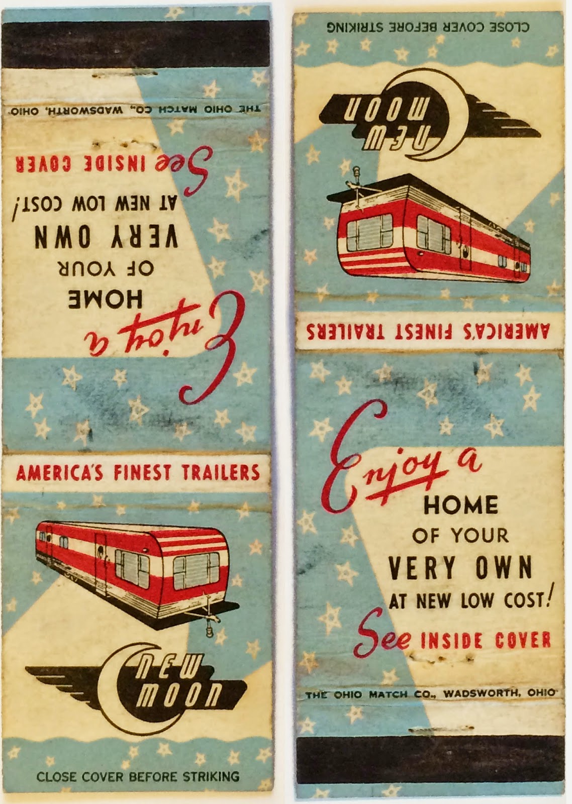

A really awesome cover for New Moon trailer homes.


Typewriters...


Four nice examples of late 1930's and early 1940's matchcover designs.


Come on down to Cafe Mocambo and watch this Debra Winger-esque woman roll around on a tiger rug.


The moon's face is priceless on this girlie cover.


Here's yet another cover with a lady in a martini glass.


I forget who handed me this cover for the Whiting Hotel in Stevens Point, Wisconsin, but I'm glad they did. The back panel of this cover is pretty funny (see below).


Detail of the Whiting Hotel matchcover depicts a young, orange haired Johnny Bravo (see below) from Cartoon Network fighting a man with deformed trapezius (upper and mid-back) muscles and abnormally low kneecaps while an unidentified gun toting man who may possibly be Colonel Sanders or Uncle Sam watch along with W.C. Fields, a mustached butler with gigantism, and an ugly man in a white dress.


This freebie table bobtail cover is hilarious.


Read it a couple times if you have to.


I like the older industrial covers because visually they're very interesting, but they also represent a time in this country when we designed and built things using our own natural resources that made our lives better and didn't rely on the cheap labor of other countries to manufacture them. The items America produced during this time were of high quality and lasted far longer than the same contemporary items that are now imported. In my opinion all of these old industrial product matchcovers represent the jobs many Americans in this country once had. 

Above: Darling Valves, manufactured in Williamsport, PA and the Nelson Studwelder (my favorite matchcover from the RMS convention).


Roper's Ribs in the Jennings neighborhood of St Louis.

Roper's Ribs was a great choice to try some St Louis style barbecue. Denise and I shared a giant order of ribs, brisket and shrimp that was fantastic. Their potato salad was also very, very good.


A thrift store we stopped at with a vintage 7 Up sign in the window.


"The Mississippi. The mighty Mississip. The old Miss. The old man." -Clark Griswold

The St Louis Arch is huge and you can see it from the interstate.
"Hey, see that, kids? That's the St Louis Arch, the gateway to the west. It's over 600 feet tall and there's an elevator all the way tot he top. That's 60 stories to you and me."


I actually got to do the thing I wanted to do most on this trip, which was to go and see the St Louis Arch. Thank you Angelus Club president Denise McKinney for taking me out there. You rock.


The Ashley Street / Union Light Power House once provided steam heat and electricity to all of downtown St Louis. The neo-gothic architecture of the building is amazing and I would have loved to have gotten a closer look. More here: http://www.examiner.com/article/ashley-street-power-house-st-louis-s-electric-power-landmark


The 34 four foot tall Vess soda bottle in the the old industrial section of St Louis.

Vess soda matchcovers.
Me in front of the 34 foot tall Vess bottle. Loading dock hobo action in the background.


Busch Stadium, home of the St Louis Cardinals.


Denise and I stumbled onto the TUMS building that was built in 1933 while driving through the city. Check out how the lettering above the doors totally matches the lettering on an older matchcover, below.

"Perhaps the first Modernist building in downtown St. Louis, the Tums factory was groundbreaking in its simplicity. Art Deco influences can be seen in its sparse decoration, but the overall design is pure International Style, with alternating ribbons of windows and brick forming continuous bands around the facade. The tower acts as an accenting vertical element. At the other end, a second vertical component appears to be an earlier building, appearing on a vintage postcard without the International Style section."From http://www.builtstlouis.net/mod/tums-building.html


Hand lettering on the window of the Guitar Haven store.

The Crown Candy Kitchen was amazing and it looked like little had changed on the inside over the years.

I'll spend the extra 4 cents and get my horoscope while I'm in the Crown Candy Kitchen.


The Union Light / Ashley Street Power House used to provided electricity and heated steam to the entire downtown St Louis area. See more here: http://www.examiner.com/article/ashley-street-power-house-st-louis-s-electric-power-landmark


Adrian, get me a tux!

Me and my partner in crime and sister from another mister, Denise McKinney.

After at least six delays due to mechanical problems with the plane and five hours at the airport, I got a different flight out for the next day and went back to the hotel in time to go to the RMS banquet (thanks to Bill Gigantino).


Lucky me, I got to sit next to a guy who spent a good portion of the flight rubbing his knee against my leg and pulling his arm hairs out one by one (see above).


Wednesday, August 6, 2014

Cover Gallery

Instead of having a theme, occasionally I'll just post a few covers that are noteworthy for their design or historical significance.


Up first is this cover for Cafe De Paree in Los Angeles. Dine and Dance covers are my favorites and even though I'll gladly put in my collection of them, it's a shame this one was bobtailed.


Great graphics on this Castles Ice Cream cover.


The leg of the letter K that turns into a baseball-like tail is the standout for this Kellogg Real Ice Cream cover.Ice cream is a health food, indeed.


I love these older Strike Rite Matches from Canada purely for the design no matter what the business is. I can always recognize them due to their unique illustrations and great colorways.


Feeling groovy? You will if you ordered any of the groovy products offered in these national covers. I totally need a dayglo zodiac poster and a few pop art pillows to spice up my residence.


Hoberg's Summer (and Winter) Resort is nestled among the pines according to this nicely designed cover.


This Hotel Cherokee cover from Cleveland, Tennessee has a damaged striker but is nonetheless very nice. 


Two hotel covers shown above, from the Hotel U.S. Grant and the New Crosby Hotel demonstrate effective illustration and type based advertising. I count seven ink colors on the Crosby cover and can't imagine the expense businesses went to to put out gorgeous covers like these.


A great photo based cover for the Lotus Cafe shows the host and a view of the front of the restaurant.


Two nice examples of older cut rate and drug store covers.


Montgomery Wards was a heavy hitter for many years and everything from toys to clothes to tools to stereos. This older cover is probably from the 1940's. Check out the reverse side that advertises floor paint (yes, floor paint).

Detail from the reverse side of the cover advertises Wards Certified Floor Paint.


Last up is this Roy Rogers restaurant matchcover from the 1970's. Roy's was always my favorite and I always stop when I see one. Their fried chicken is the best out of any of the fast food places in my opinion.


Signage from Roy Rogers.


Monday, August 4, 2014

Janet's MARVA Pool Party

Right to Left: Greg (me), Janet, Grant and Bill.
Yesterday afternoon MARVA member Janet Stout invited us up to her house in Essex, Maryland for a pool party. Grant, Bill, Jim and I were able to attend, as well as Janet's sister and her friend (I don't remember how to pronounce her name so I won't butcher it here, but it started with an R).

We had a fantastic cookout on Janet's patio by the pool and everyone enjoyed the hot dogs, hamburgers and Janet's homemade potato salad. I also particularly enjoyed the large, home grown tomatoes and sliced cucumbers with vinegar and onions (you won't find that just anywhere).

Janet's awesome salt water pool.
It looked like the day would be cloudy and overcast and possibly rain a  little, but the sun showed up just in time to bring on a fantastic afternoon spent outside. After eating, a few of us swam, a few of us talked and a couple of guys who will remain nameless fell asleep in the sun.

Janet also had some great covers saved for me:


We'll start this off two really interesting ones. The Hi-Ball Bar from Kansas City. This bar was directly across the street from the Kansas City Power & Light and I can just imagine how packed this place got after each shift at the power company. I particularly like the big H and little i dotted with a baseball.

The next one, Jane's Grill, is interesting for two obvious reasons: It's an older cover, most likely the 1930's and the name, Jane's Grill suggests a female owned business before many females were owning businesses. Here's where it gets interesting, the term Tables For Ladies has a pretty important meaning.Tables for Ladies:
"alludes to a recent social innovation, in which dining establishments advertised "tables for ladies" in order to welcome their newly mobile female customers. In the past, it had often been assumed that women appearing alone in restaurants or bars were prostitutes in search of business; now, dining on their own or with other women, they would be treated respectfully."
Source: http://www.metmuseum.org/toah/works-of-art/31.62  (check out Hopper's painting, it's pretty interesting, too)


So here we have what might be a female run business, the socially innovative "tables for ladies" message, and a naked woman riding a... ahem, hot dog. Who knows, maybe ole Jane had a good sense of humor about it.


A few really nice matchcovers for men's clothing. Today it's polo type shirts, but back in the 1930's and 40's it was real shirts, what we call now dress shirts. The color and typography on the two Mark Twain covers is pretty fantastic.


A few more very nicely designed covers with excellent type and color.


I love coffee matchcovers like this. Why? Probably because I dig the old metal cans like this that they used to come in. These type of cans were so plentiful and cheap at Richmond's Bellwood flea market in the late 90's, I had a whole bunch of them. Anyway, these are some nice examples, great color, great type and I noticed that these ones have the little metal keys included in the illustrations.


Two matchcovers for two motels with the same name.Although the green The Surf motel cover is nice, it's the Surf Motel I think is the finer of the two entirely because of the wild 1950's architecture. 

The Surf Motel as it appears today.

A lot of these old places have been bulldozed and replaced with a Starbucks or Chipotle in some new, soulless type of building that has no character. However, I looked it up and the Surf Motel is alive and well in San Francisco.


Three nice covers from what were probably pretty swinging nightclubs in California, Alaska and Missouri.The Premier Club is probably the most interesting of the three as far as design. 


A stock cut girlie I've seen before.


This older cover for Airmate Hosiery is a major award of sorts.After World War II and nylon hose was again available to women in the U.S., I guess it needed to be advertised. This one takes the cake with a lady riding on an airplane, reining it in like musher on a dog sled.


This cover for King's is most notable for its unconnected script lettering and extra long descender used in the word "in". 


Also notable is this M.C. Escher-like woman who impossibly seems to be inside, outside, around and going through the martini glass all at one time. Reminds me of this:


Last up is this bobtailed Sigari Marconi cigars cover from at least the 1930's. 5 cigars for 10 cents? A true bargain.


Big Boy: Should He Stay Or Go?


I found a nice Big Boy postcard for $3 at the flea market this weekend. It's signed by the Big Boy himself. I like this highly stylized, airbrushed look. No mention of who the artist was, but that's typical for items like this. It's not a matchbook, but since Big Boy covers are pretty popular so I thought I'd throw it in.


Also included in the clear sleeve the postcard came in was this neat, unused Big Boy sticker. If you don't remember this, Marriott Corporation launched this advertising scheme in Fall of 1984, complete with commercials using A particular song by The Clash (I'll let you guess which one). Get your vote in by May 6, 1985, people.


Article from Cincinati magazine, May 1985. For the rest of the article, go here: